Barley & Pfeiffer Architects Clients utilized Alan Barley’s unique roof design and eGauge system to maximize energy generation:
We maximized the available roof space with 56 250 watt panels and so far on any given cloudless day we generate more electricity than we use. Overall since October 4th we’ve generated 80% of our usage. With so many cloudy days the past couple months I’m predicting we’ll do at least as well and maybe even better this summer given the longer days especially if one of those cloud free high pressure zones sits over top of Central Texas for weeks at a time.[youtube=https://www.youtube.com/watch?v=tPDO89D2XtI&w=560&h=315]
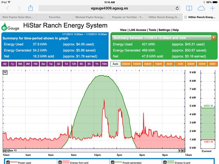 You might also be interested in looking at our eGauge monitoring data. In case you’re not familiar with eGauge it’s a real time interactive device that records both solar generation and total electricity used. The graph below reflects yesterday’s solar generation and energy usage. On a cloudless day like yesterday we get a perfect bell curve. I have to think that is due to both site orientation and Alan’s unique roof design. The summary in the blue box is for the time period in the graph. The green box is a summary since the beginning of the year. The bar on the far right is today’s realtime generation and usage. Both the time frame and summary levels can be interactively changed by clicking on the two down arrows or the time frame buttons above the graph. What we like about eGauge is we’ve been able to use it to identify some of our more energy consumptive appliances like my clothes dryer (that’s the 2 red outlined white peaks in the graph) and our creek pump which we’ve since reduced to running just an hour or two a day.
To see our data real time go to https://egauge4309.egaug.es/. Feel free to use the interactive features if you want to review current or historical data and see just how neat eGauge really is.